
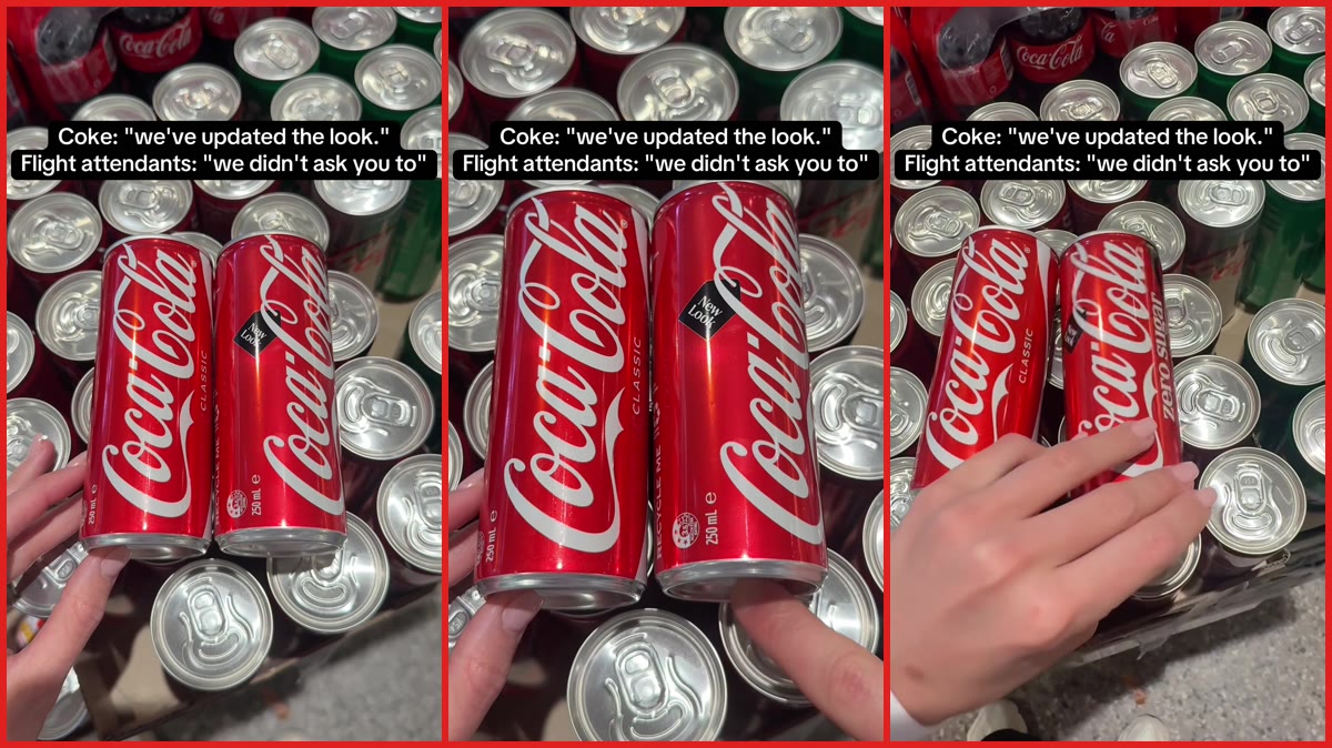
A flight attendant named Ava, who posts on TikTok under the handle @avamorello, has shared a video showing how Coca-Cola’s updated can designs have caused mix-ups for her at work. The video, which features no spoken audio, uses on-screen text and a visual demonstration to make its point about the similarities between the different can designs.
In the video, a hand is shown holding two red Coca-Cola cans side by side. On-screen text reads: “Coke: ‘we’ve updated the look.’ Flight attendants: ‘we didn’t ask you to'”. The background appears to show dozens of other red and silver beverage cans, which seems to suggest a storage or inventory area on a plane.
The video’s caption states, “Lost count of how many wrong Cokes l’ve handed out this week 🥴😂”. The caption also includes hashtags such as #newlookcoke, #cocacola, #flightattendantlife, and #cabincrew.
The video highlights how similar the classic and zero sugar cans now appear
The video appears to show a direct comparison between two different Coca-Cola can designs. In the clip, the can on the left is labeled “Coca-Cola Classic,” featuring the brand’s iconic white script and a white wave design on a red background. The can on the right also has the red background and white script, but it includes a small black label that reads “New Look” and indicates “250 mL.”
The hand in the video then rotates the can on the right. As it turns, the words “zero sugar” become visible, written vertically in white text against a black vertical stripe on the can’s left side. The overall red color and white script remain consistent with the classic version, which appears to be the source of the confusion being described.
The visual comparison suggests that at a quick glance, the two designs may look quite similar, potentially making it difficult to distinguish between the classic Coke and the zero sugar version without looking closely. This appears to be the central point of the video, which focuses on how the updated design may not be distinct enough for people who need to quickly identify the correct can.
Viewers in the comments section shared similar concerns about the design
The video seems to have resonated with viewers, particularly those who work in service roles or have specific dietary needs. Several commenters expressed frustration with the new can designs, with some noting that the changes make it harder to quickly tell the difference between regular and zero sugar versions. Flight attendants have drawn attention on TikTok for far friendlier cabin moments too, like a Delta flight attendant asking passengers to write their seat numbers on treats they bring for the crew.
One commenter wrote, “Ik ppl say to ‘ read’ but listen zero sugar versus full sugar needs to more noticeable if a difference esp considering the medical issues it can cause if you drink wrong one.” Another simply asked, “Literally WHY would they do that.”
A commenter who identified as diabetic shared a more personal concern, writing, “I RELY on that black lettering for zero cuz I’m diabetic. Why on earth would they do that. Good thing I always double check anyway.” This comment suggests that for some consumers, the ability to quickly and accurately identify zero sugar products is not just a matter of preference but a health consideration.
Another commenter described a scenario that appears to be common for service workers, writing, “Passenger: ‘I asked for zero sugar, not original!’ Me: rotates the can.” The comment seems to illustrate the kind of interaction the video’s creator may have been describing in her caption. Cabin crew interactions don’t always go smoothly for passengers either, as one woman who switched to an empty row on a Southwest flight had a flight attendant threaten to kick her off.
The frustration was echoed by others, with one commenter writing simply, “It’s the WORST 😭” and another adding, “As someone who gets severe gi issues from ‘zero sugar’ sodas this is my worst nightmare.” These comments suggest that the concern about the can designs extends beyond just service workers to include consumers with specific health needs or dietary restrictions.
The video and its comments appear to highlight a broader issue about product design and accessibility, particularly for people who rely on clear visual cues to make quick decisions about food and beverages.